
For books on scientific topics, it has always been quite common to use artwork on the cover that is both aesthetic and appealing and related to current trends in science, thus, to use illustrations that are, in a sense, icons of the scientific development of their time. Bee's recent post about Bacon reminded me of a wonderful example of an (in my eyes) extremely attractive book illustration which demonstrates this point: It is the frontispiece of the Instauratio Magna, the major work of Francis Bacon containing the Novum Organum, where he explains his new method for scientific investigation.

It's not a cover illustration as we know it today, since back in 1620, when it was published, books were just bound in heavy leather, and there were no book jackets. But the ships that come in from the wide, open sea of unexplored knowledge, and bring with them funny plants and animals from remote and newly discovered parts of the world are a beautiful metaphor for Bacon's' ideas at a time when British mariners started to rule the waves.
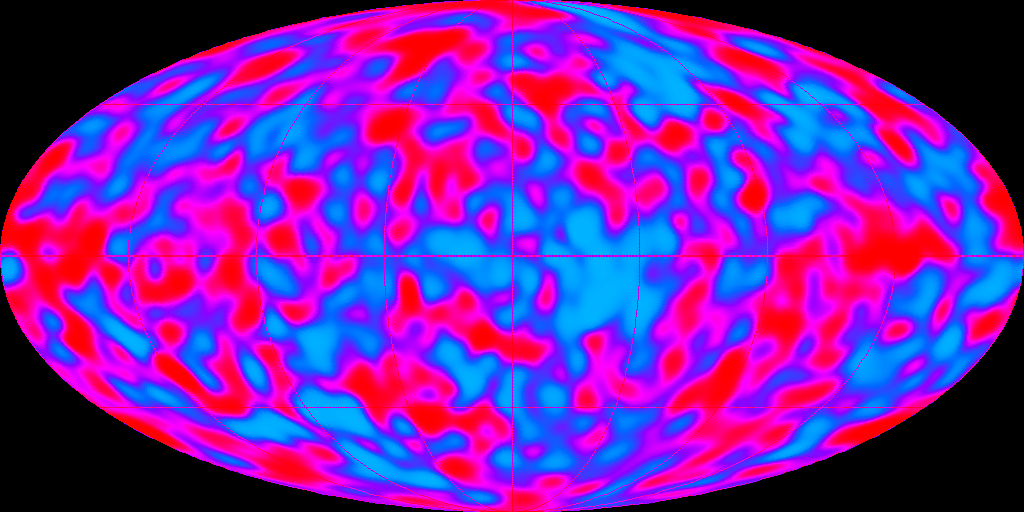
Modern tools of exploration are not any more large ships, but instead test tubes, microscopes, telescopes, space probes, and particle accelerators. And indeed, spectacular photos by the Hubble Space Telescope feature on the covers of many books on astronomy, cosmology, or even string theory. However, with the huge amount of amazing Hubble pictures, the one icon picture is missing - a role maybe best taken over by the COBE, then WMAP maps of the cosmic microwave background, as far as astrophysics and cosmology are concerned.
Here, following a severe personal bias, I want to talk a bit about two beautiful illustrations coming from particle physics - one quite old by now, but still often in use, the other more recent, and, I guess, with a huge potential for use in the near future ;-)


The first illustration shows a chaos of curved, fancy blue lines against an amber background. It comes with several degrees of changes applied to the original, and it was used recently on the covers of the Jonathan Cape edition of Not even wrong and The Scientist as Rebel by Freeman Dyson, New York Review Books (2006). The photo also features on The Particle Garden: Our Universe As Understood by Particle Physicists by Gordon Kane (Helix Books, Addison Wesley Publishing Company, Paperback, July 1996), Understanding the Universe: From Quarks to the Cosmos by Don Lincoln, (World Scientific Publishing Company, October 2004, Paperback), and the now out-of-print 1994 Canto edition of Quantum Physics: Illusion or Reality? by Alastair Rae - that's where I had seen it for the first time, as far as I remember.
There may be many more book covers where it has been used, perhaps someone knows of some other titles.
The origin of the illustration has been discussed before on Peters blog, and Peter refers to the interactions.org database.
But the original photo is from CERN, and can be found with more information and links at the CERN Document Server, cdsweb.cern.ch/record/39312. Included there is also a short list of some publications where it has been used.
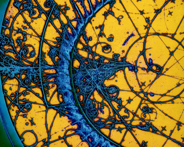
As for the content, the photo shows, according to the CERN record, an artistically enhanced picture of particle tracks in the BEBC, Big European Bubble Chamber. Bubble chambers were the devices of choice for the detection of the tracks of charged particles created in all kinds of nuclear and elementary particle collisions in the 1960s and 1970s. Filled with a liquid that can be brought in an overheated state, charges particles which cross the liquid serve as the seeds where boiling set in, and thus, tracks are marked by traces of small bubbles of boiling liquid.
More background on the CERN image can be found in the August 2004 issue of the CERN Courier, with the figure caption Picture postcard: Famous postcard view of a neutrino interaction in BEBC (the Big European Bubble Chamber) filled with a neon-hydrogen mixture. Indeed, the picture was sold as a postcard at CERN when I was there for the first time in 1999 - I had sent this postcard to several friends then!
Concerning the science behind the picture, it seems that the BEBC was used mainly for neutrino experiments - the December 1998 issue of CERN courier has more about that, www.nu.to.infn.it/exp/all/bebc links some papers related to BEBC experiments, and just citing from CERN Bulletin 20/2004, which shows this photo of the installation of the BEBC:
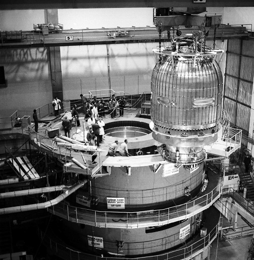
cdsweb.cern.ch/record/41546: The vessel of the Big European Bubble Chamber, BEBC, was installed at the beginning of the 1970s. The large stainless-steel vessel, measuring 3.7 meters in diameter and 4 metres in height, was filled with 35 cubic metres of liquid (hydrogen, deuterium or a neon-hydrogen mixture), whose sensitivity was regulated by means of a huge piston weighing 2 tonnes. During each expansion, the trajectories of the charged particles were marked by a trail of bubbles, where liquid reached boiling point as they passed through it. The first images were recorded in 1973 when BEBC, equipped with the largest superconducting magnet in service at the time, first received beam from the PS. In 1977, the bubble chamber was exposed to neutrino and hadron beams at higher energies of up to 450 GeV after the SPS came into operation. By the end of its active life in 1984, BEBC had delivered a total of 6.3 million photographs to 22 experiments devoted to neutrino or hadron physics. Around 600 scientists from some fifty laboratories throughout the world had taken part in analysing the 3000 km of film it had produced.
The BEBC is now on display on a lawn near the CERN cafeteria, where it looks like some alien spaceship ;-)...

cdsweb.cern.ch/record/41091: Group of belgian physics teachers in front of BEBC bubble chamber, in March 2000
Bubble chambers, like emulsion film techniques or similar methods to record tracks of particles, have one big disadvantage: events are fixed on film, and to do a physics analysis, thousands of photos have to be checked "by hand". This is a very tedious job, which often was done by women "scanners".
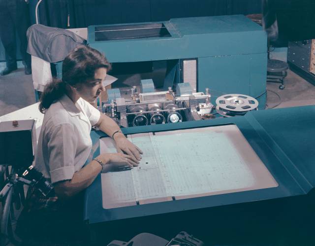
LBNL Image Database 96602983: Operator, Barbara Srulovitz, maps particle tracks with Alvarez Scanning and Measuring Projector.
In a sense, the huge BEBC was a kind of dinosaur, the end point and culmination of this type of detection device. For an automized analysis using electronic computers, it would have been nice to have complete information on all particle tracks available in some electronic form. That's what can be achieved with wire chambers, or, a widely used variety of these kinds of detectors, time projection chambers (TPCs).
A time projection chamber is a large chamber filled with gas. High-energy charged particles emerging from a collision event will ionize this gas along their paths, leaving behind tracks of electrically charged gas molecules. The whole TPC is subject to a homogenous electric field, which moves the pattern of tracks drawn in electrically charged gas molecules towards small-meshed grids of wires. There, the ionized gas molecules create electrical signals, and from the location of the wires which are triggered and the time delay between the collision and the detection at the wire (which is the time the ionized gas molecules need to drift from the position of the track to the detector wire), it is possible to reconstruct the complete three-dimensional pattern of all tracks of charged particles emerging from the original collision. TPCs are now in use since more than 25 years and are a central component of many particle physics experiments. I am not an experimentalist, so I have no inside view of all the complexities and difficulties which are part of this data gathering process. But I am amazed that it is possible to reconstruct particle tracks with a spatial resolution below one millimeter, using state-of-the art TPCs!
In collider experiments, such as at RHIC, TPCs are large cylindrical chambers, with the central axis of the cylinder coinciding with the beam axis and the collision point at the centre of the chamber. A TPC is the main detecting device of the STAR experiment, the Solenoidal Tracker at RHIC. This photo, which is part of a series of photos provided by the Lawrence Berkeley National Lab, shows the TPC of STAR.

It was with data from the TPC of STAR that this graphical representation of one of the first gold-gold collisions at RHIC was created in June 2000.
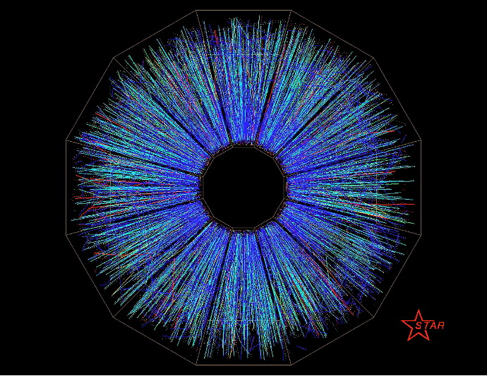
The graphics shows the projection of the tracks of electrically charged particles emerging from the gold-gold collision. There are in the order of 3000 charged particles emerging from central collisions, and the radial motion of these particles is displayed in the figure.
The analysis of the radial motion of all the particles produced in a heavy-ion collision provides such observables as the elliptic flow, which describes the deviation of the pattern of motion from perfect radial symmetry for non-central collisions, and which allows to estimate the viscosity of the hot and dense nuclear matter created in the collision.
But this is a second step of the analysis: First, the tracks, and momenta, of as many particles as possible have to be determined. These tracks make up the wonderful picture from STAR, with its striking resemblance to the iris of an human eye. It shows a central part of the science of heavy-ion physics in an eye-catching way, and features in many talks and articles about heavy-ion physics. This STAR picture has become kind of an icon of heavy-ion physics.


Which brings me back to my initial topic of the book covers: The RHIC "iris" of the STAR-TPC has made it, as far I could see, on the covers of The QCD Vacuum, Hadrons and Superdense Matter by Edward V. Shuryak, (World Scientific, 2nd edition, 2004), Alpha and Omega: The Search for the Beginning and End of the Universe by Charles Seife (Viking, 2003), and Quark Gluon Plasma 3 edited by Rudolph C. Hwa, and comment writer X. N. Wang (World Scientific, 2004)
But considering the dark and mysterious appeal of this photo, my guess is that we will see it more often on book covers of future, new releases.
TAGS: Physics, RHIC, Particle Detectors, Book Covers
Dear Stefan,
ReplyDeleteThanks for this truly amazing and informative post! You know, I thought recently as well, one has to expect a whole series on books with the CMB image on the cover. Best,
B.
It's really painful for a random crackpot to argue that her or his book essentially invented this kind of pattern on book covers, and it is even worse to promote this misinformation on other blogs.
ReplyDeleteThis kind of cover has been used many times in the past, for example in 2000 by Brian Greene's The Elegant Universe, French edition.
Hi Lubos,
ReplyDeleteas so often I have no idea specifically what your problem is? We haven't promoted that anybody invented any pattern. Neither do I know what crackpot you are referring to, but the above mentioned book The Particle Garden, by GL Kane was published in 1996, long before Greene's Elegant Universe.
Best,
B.
Back in 1982 I designed a CAMAC trigger controller for a time projection chamber at UC Irvine. It was a search for double beta decay. Steve Elliott got his PhD on the experiment and has been chasing neutrinos ever since.
ReplyDeleteA post long ago on Woit's blog suggested that perhaps "What is the world made of? : Atoms, leptons, quarks, and other tantalizing particles" by Gerald Feinberg used the bubble chamber image.
ReplyDeleteBut the book dates to 1978.
The problem is that you have written that the blog of the critic of science describes "the origin of the picture". It certainly doesn't and all the accusations that Freeman Dyson has "stolen" the picture over there, as well as many other things, are just unbelievable.
ReplyDeleteThe article you link contains a lot of untrue statements about the real origin of the picture, plus a lot of astonishingly dumb conspiratory theories why a dumb book was rejected by all serious academic publishers. And you intentionally link to this garbage.
That's what I view as a problem because there are demonstrably hundreds of people who can't distinguish that the texts over there are absurd lies, and you help to increase this amount of general ignorance among the laypersons.
Dear Arun,
ReplyDeleteThanks, yes, this was also mentioned on the site at Peter's blog, one of the last comments.
Dear Lubos,
The problem is that you have written that the blog of the critic of science describes "the origin of the picture".
We have written that the origin of the illustration has been discussed there, not described, and that it has. The purpose of this very post was to tell some details of where the picture comes from, maybe you should just read it.
Further, I'm pretty sure I didn't ever write something about Peter Woit being a 'critic of science'.
Besides this, it's my decision who I link to, and who I don't link to. As much as it is your decision who you link to. And don't link to.
Best,
B.
Dear Lubos,
ReplyDeletethank you for your careful reading of the post and your thoughtful and constructive comments :-)
Just let me add the following to Bee's comments:
First, I'm well aware of the cover art of the French edition of the "Elegant Universe", which you have mentioned repeatedly. It's also from CERN, cdsweb.cern.ch/record/39452, and shows, according to the CERN database, the decay of positive pions captured on a false color streamer chamber image.
Browsing through the CERN Press Office Photo Selection of Particle Collision Tracks, you will probably find many photos or simulated images that you have seen on one occasion or another, and sometimes also on book covers.
However, I deliberately chose to write about the Patrice Loiez rendering of the BEBC photo, because I personally find it more beautiful, from a purely aesthetic point of view, and because I have seen it much more often at many different occasions over quite a long period of time.
Second, I understand that your main objection concerns one specific link in the post. I have added this link because the discussion there was, some time back, one reason for me to try to find out more about this bubble chamber photo, which I had seen several times before. You are free not to link there on your blog. Moreover, this post is not about specific books, and I appreciate if you stop pursuing your personal crusade in this thread.
Best, stefan
Dear Stefan,
ReplyDeleteYou write: Books which want to be sold need attractive covers. Do you really think this is an important point? I hardly chose books by their cover, you don't see it when you read the book anyway. The most important thing I'd say is the text on the back flap. After this, much more important than the cover I find the typesetting and just the quality of the print (and pictures, if there are any). There's nothing more annoying than too narrow fonts, bad layout, or bad printing. Best,
B.
Hi Arun,
ReplyDeleteunfortunately, there is no date given for the photo in the CERN database, which is a pity. But since the BEBC started taking photos in 1973, it may be perfectly well possible that this illustration was used already in 1978.
Best, stefan
Hi Carl,
ReplyDeleteBack in 1982 I designed a CAMAC trigger controller for a time projection chamber at UC Irvine. It was a search for double beta decay.
I have a stupid question: why is a TPC used as a detector in a double beta decay experiment? I mean, naively, I would have thought that the most important thing in such an experiment is to trigger on coinciding emission of two electrons, and maybe some particles kicked by the neutrinos, and an exact measurement of the electron energy? Why does one need information about the tracks?
Best, stefan
Dear Bee,
ReplyDeleteDo you really think this (Books which want to be sold need attractive covers.) is an important point?
Yes, I think so - and I guess most publishers would agree. Cover design is an essential part of book marketing.
I mean, the cover may be not so important if the author is famous and the book is sold anyway, or if the topic of the book has already been debated a lot.
All the points you mention, text on the back flap, typesetting and page design, qualitiy of paper and printing, that's all important too, but only in a second step.
First, you have to pick up the one book among the thousands of others, and only then you read the back flap and have look inside.
Best, stefan :-)
Stefan, the double beta experiment had a big Helmholtz coil. You determine the energy of the electrons by the geometry of their tracks in the magnetic field. The TPC finds the geometry of the tracks. The trigger module watched the outputs of the wires and captured data when something looked interesting. I designed the trigger controller to be software controllable so that they could trigger on various numbers of coincidences.
ReplyDeleteI left physics because it was obvious that the only job I could get was in experimental, and I figured I could (and did) make better money in industry. My heart was in theory. I'm getting close to completing a book analyzing the standard model from the density operator point of view.
Stefan,
ReplyDeletehttp://www.aip.org/png/images/rhic-end.jpg
It is true that a book cover can be of advantage when it comes to selection, and is part of the marketing I am sure.
I enjoyed your article too because of the "reflection of the source" to which these book covers are drawn, much as one is drawn to the history of science.
Good job on the article.
oops....
ReplyDeleteLink connection should read,"reflections of the source.
Nice post!
ReplyDeleteHow did you stumble on that picture of the bubble chamber on the lawn at CERN? It's actually the group photo of one of the biyearly trip my university (Vrije Universiteit Brussel) organises to promote publice understanding of science. There's one lying around with myself on it as 16 or 17 year old depending on what day it was (I actually turned 17 in CERN that year) :-)
-Dimi
"Bubble chambers, like emulsion film techniques or similar methods to record tracks of particles, have one big disadvantage: events are fixed on film, and to do a physics analysis, thousands of photos have to be checked "by hand". This is a very tedious job, which often was done by women "scanners"."
ReplyDeleteTell me about it... as a first year master student I had to do an elementary particle physics lab where one of the assignments was just that. The VUB was part of the GARGAMELLE collaboration, so we had tons of tape lying around. Using a multi-angle projection table and a ruler we had to determine the lifetime of the kaon. I remember getting kudos from the professor because we got a really good estimate using rather primitive equipment :-)
We did some of these measurements for a couple of days, which was more then enough! I can't image doing this for months if not years on end...
-Dimi
Dear Stefan,
ReplyDeleteYes, I think so - and I guess most publishers would agree. Cover design is an essential part of book marketing.
I have no doubts it is, I'm just wondering whether it pays off. I'm not saying the cover is unimportant. Maybe it makes people pick up a book, but this I think isn't a so important factor. More important reasons for having a look at the book: having heard either of the book or the author before, prominent display in the store, the title and genre being of interest. After that I'd count in the cover.
But who'd decide on whether to buy a book or not based on the cover?
Worse, a bad cover can cause confusion so people DON'T buy a book. E.g. what if Peter's book had, say, an UFO printed on the front? It is better to have no picture at all than a misleading one.
All the points you mention, text on the back flap, typesetting and page design, qualitiy of paper and printing, that's all important too, but only in a second step.
How do you know? Seriously, are there any statistics about it? I actually doubt it. I mean, there might be exceptions, like, typical gift books that you only buy because they look nice. But I ask you again: if you read the back flap and you don't like it, would the cover convince you to buy the book anyhow? If you think the print is awful and hard to read, would the cover convince you to buy the book? This might be a second step to investigate, but concerning your decision I think it's a more important factor.
First, you have to pick up the one book among the thousands of others, and only then you read the back flap and have look inside.
Sure, there's always the random first interest factor. But I don't agree on the common believe that all marketing is better than no marketing. You don't want people to pick up the book, look who took the picture and where, and drop the book, do you?
Best,
B.
There is a publisher of textbooks, Wiley-VCH, whose covers and typestting I really like; their older books may not be so good. See for example, "Special Relativity and Motions Faster Than Light" by Moses Fayngold, 2002.
ReplyDeleteI have discovered one of Lee Smolin’s objection to a string theorist? They are only craftsman, and not seers. :) But truly, should we judge a book by it’s cover?:)
ReplyDeleteI was thinking of your post Stefan when I wrote the above.
I still think a good book cover should have some insight into what is being proposed? "Shoes, with shoelaces?" Come on. :)
Hi Dimitri,
ReplyDeleteHow did you stumble on that picture of the bubble chamber on the lawn at CERN?
That was by chance, when browsing the CERN photo database for "BEBC", the big European Bubble Chamber. I came across this photo and remembered this odd-looking big thing on the lawn near the cafeteria, and just then understood that this was a bubble chamber. The photo was taken on March 7, 2000, according to the database entry...
Best, stefan
Hi Chinmaya Sheth,
ReplyDeleteindeed, the Fayngold book has an attractive cover... It's funny, but it seems that it is advertised at amazon.com with the wrong cover, which look less interesting. So this could be used to check whether there is an influence on sales ;-)... On the other hand, Wiley-VCH titles are often unduly expensive, in my opinion, and then, the most beautiful cover art does not help to raise the sales numbers, I guess...
By the way, Wiley-VCH had a series of popular science titles (in German), where the cover desing, and the choice of book titles, in my opinion did not foster sales, even so the books were quite interesting - look, for example, at Zoff im Elfenbeintumturm. The original English edition made a less sloppy impression... However, the cover design of this book series has been changed, in the meantime.
Best, stefan
Dear Bee,
ReplyDeleteI completely agree, there are many important factors why people buy or buy not a certain book, as you say: having heard either of the book or the author before, prominent display in the store, the title and genre being of interest.
But in these cases (besides prominent display, other forms of agressive marketing), you know already what you are looking for.
What I had in mind is that if you are browsing around for something that may be interesting to you, say, on a table or a shelf with dozens or hundereds of different titles, then, the cover illustration can well decide whether you pick up a book and look on the back flap or at the table of contents or not... Of course, at this point, if you are not convinced by what you get read, an attractive cover alone does sell the book.
But this was the situtation I had in mind: convincing potential readers in booksstores with an enormous offer of titles to get interested in the first place.
Unfortunately, I do not know of any solid statistics about this, or of well-studied examples where different covers for the same title had an impact on sales. And I don't know either how much marketing research in this area goes beyond anectodal evidence. I should try to check this...
I also completely agree that bad cover design can probably be a nuisance. For example, besides these Wiley-VCH books, there are other examples, in my opinion, for trashy cover desing of otherwise really great books. I could imagin that these books could sell better with a different cover. But that would be a case in point that the cover is important?
Best, stefan
FYI :
ReplyDeletehttp://www.amazon.com/Front-Cover-Great-Jacket-Design/dp/1840004215
http://www.amazon.com/Front-Cover-Great-Jacket-Design/dp/1840004215
The first time I came across this said image of "bubble chamber", was when "Marcello Glasier ?" was using it to describe interactions from CERN, WRT matter/anti-matter anhilations. Marcello?..was a guest on S W Hawking's :Universe Documentary.
ReplyDeleteThe image is also on the cover of Open University coursework for Astronomy S102.
The image is very striking, and I recall Marcello describing it as a Jason Pollack ? like abstract art image rendition.
Sorry if I got the names wrong, but it was a while ago, mid 90's !
I've searched through my personal physics library, and found very little in cover design that could be considered interesting. Hordes of QFT books with Feynman Diagrams for covers, but not much original.
ReplyDeleteLeucipo, I'm with you on this one!
ReplyDeleteEven though the content of A. Zee's "Quantum Field Theory in a Nutshell" falls outside my comfort range for consumption, its jacket is an excellent example of a type that I prefer. As a general rule, I favor - more or less - tradition book jackets: jackets that display anthropogenic works of art, while confining scientific art, such as particle collision tracks, to the book's interior.
I'm particularly fond of the jacket for A. Zee's pop-physics work, "Gravity at Work and Play". This book provides a remarkable overview on matters of gravity. On top of that, it's laced with thought-provoking messages: messages behind gravity's nature, of course.
Nonetheless, I'm especially captivated by the jacket for "Gravity at Work and Play". This jacket is simply a black@white snapshot which - oddly enough - has a film noir look to it. This wide screen photo features both an unusual camera angle and brilliant shadowed lighting: two traits which are quintessentially noir. Despite Zee's jacket not integrating the super-symmetry element of gravity into the image, the jacket does (quite nicely, in fact) incorporate mirror symmetry into the black@white photograph.
Speaking of frontispieces, I'll contend when one examines in detail the frontispiece of Kepler's "Rudolfine Tables", one will realize that Kepler had an extraordinary gift - the gift to integrate the two great titans of culture: art and science.
ReplyDeleteAlthough Kepler has been tight-casted as a medieval throwback of sorts, one certainly can't deny that he's an embodiment of a perfect Renaissance man. While physicists today are no less competent at producing earth-shaking science, unlike Kepler though, they are too specialized to create mind-boggling works of art.
The public library, less than a mile from my house, has "What is the World Made Of? Atoms Leptons Quarks and Other Tantalizing Particles" by Gerald Feinberg. So I borrowed the book.
ReplyDeleteThe cover is indeed of a bubble chamber, but now the CERN one, and not stylized.
Jacket illustration: Photograph of a bubble chamber in which an invisible neutrino strikes a nucleus, producing a muon and other particles. Photograph, taken at Fermi Lab, courtesy of Dr. C. Baltay and Mrs. C. Nobile of Columbia University.
As an occasional visitor:
ReplyDeleteStefan - I enjoy your post very much. Learn much and welcome more. I will visit more often as a result.
Bee - A book is a business; the jacket design is far more important than is rationally justified. That's why publishers insist on control of the jacket design. You will be enlightened if and when you write your own book and need to deal with the 'irrational' world of sales and marketing! Somehow, I know one day you will have something so compelling, hopefully in physics, that you want to write a book.
lumo - Every time and every blog you touch, you made a stink. Grow up and take a basic course in interpersonal communications. Bee is the last one decent enough not to block you, but I don't know how much longer.
"How do you know? Seriously, are there any statistics about it? I actually doubt it."
ReplyDeleteYes, but not many. In 1998 Penguin released the results of a study and found word-of-mouth and a few other things, including cost, had more impact on a book's sales.
I also have a copy of a study done that involved children creating covers for books in a children's library, and there was definitely an increase in the lending of the books with the new, colourful colours (I am sorry, but I don't have the study on this computer to give you more info).
And from an article I wrote some time ago:
"What I found to be most interesting in that survey, published March 3, 2005 by World Book Day, was that 25% of readers claimed to buy books based on friends' recommendations (that figure rose to one-third in the under-35 demographic); 26% bought books based on author familiarity; 6% bought a book because they saw it advertised and only 7% cited cover design."
I believe covers do many things:
1. A lousy cover can unsell a book. When choosing between two equally desirable books, similarly priced, I believe the cover can weight the decision.
2. In some genres, such as romance and sci-fi, the covers themselves are collectible.
3. Like any marketing tool, the graphic can pull a buyer to take a closer look.
4. As the book buying marketplace moves more online, thumbnails of book covers are becoming more important.