Pages

Sunday, December 16, 2007

ain't it thrilling

It's this time of the year. This time when I get emails from friends and relatives who I haven't heard of the last 12 months. Do you have snow, they ask. Well, yes, we do have snow. Let me tell you how that looks like here.

    When it snows, ain't it thrilling,
    Though your nose gets a chilling

I try to leave the house in the late morning but find I can't open the door, since the wind has pushed up half a meter snow in front of it.

So I leave the house through the back door just to realize that it's still snowing rather heavily, and I either can't see where I'm walking because my glasses are all snowy, or I can't see where I'm walking because I'm not wearing the glasses. Fighting with the glasses I drop the house-key on what I think should be lawn somewhere below the layers.

I spend 10 minutes searching the stupid house-key, just to then find that it was actually not the house-key I took with me, so I have to go around the house back to the front door.

Where it dawns to me that the reason why the walkway isn't cleared is that my landlord is on vacation since yesterday. And since I haven't really socialized with the neighbors, this means there's nobody who will let me into the house.

I shovel away the snow enough to squeeze myself into the hallway, and then spend another 10 minutes trying to convince an elderly lady that I am neither trying to rob her nor will I sleep in the lobby if she lets me in. I convince her with proving the key I took with me fits to the mailbox, which reveals 3 weeks worth of Pizza delivery flyers.

I then find it would be a better idea to take the car. My timing turns out to be excellent because somebody is just leaving directly in front of me. That somebody courageously makes it down the driveway, where his car gets stuck with the headlights halfways buried in snow where the sideway ends.

It takes 15 minutes to dig out the neighbors car and shove it onto the road. After which I start up high speed and hop on the road as well. The radio announces an endless list of closures and cancellations, and informs me the government of Ontario recommends to drive only in case of emergencies until the roads are cleared.

    Sleigh bells ring, are you listening,
    In the lane, snow is glistening

A couple of cars slide around, make 360° turns on the street crossings, or spray snow fountains while unsuccessfully trying to get through the tougher parts of the road.

I consider getting winter tires, what do you think?

People walk on the streets because the sidewalks are a disaster. Dogs dig their noses into the snow where other dogs have pissed holes. In rare places snow has been piled up already on the hills from last week, that easily exceed several meters height. Some street signs get buried in these hills. And folks, this is just the beginning of the Winter fun!

    Later on, we'll conspire,
    As we dream by the fire
    To face unafraid,
    The plans that we've made

I think you get the picture? Let me just add the above describes a rather average winter day. For me this year is a definite improvement over last year, because I now have a garage to park the car in, so I won't have to enter through the trunk if the doors are frozen shut.

Some other things I've learned last winter:

  • Get the Coke out of the car before it gets really cold and it bursts, thereby splashing frozen Coke chunks all through the car's interior.
  • If you didn't get the damned Coke out of the car in a timely manner, scrape off the frozen Coke chunks before Spring time.
  • Don't wear shoes with laces. They will become completely stiff after two days because of all the salt on the streets.
  • Your CD player, Ipod, Digital Camera, they all have a minimum working temperature below which they will refuse to function. I recommend pairing the Ipod with one of these Chemical Hand warmers. (No idea though why the guy says there is something new about it, I've had them since I was a kid.)
  • Consider wearing socks with your Flip Flops.
  • Dry your hair before leaving the house. Dry it thoroughly.
  • Softness of chewing gum depends crucially on the temperature.
  • If your stupid sliding window doesn't open, better leave it closed. If you'll try to unfreeze the ice, chances are you won't be able to close it again which is much worse.
  • Don't cry if the outside temperature is below - 25 ° C.

Gravitational Microlensing for Detection of Extrasolar Planets

Einstein taught us mass curves space-time, and everything moving in it has to behave accordingly, even light. Obeying the laws of General Relativity, large masses bend light rays around them. Essentially a mass acts like a convex lens, and collects light rays that otherwise would have missed the focal point - here the observer, an Earth or space based detector. This effect is called gravitational lensing. One speaks of gravitational microlensing if the object causing the light bending is of solar size. (If you have the Windows Media player, check out this nice animation from the NSF.)

If the lensing object crosses our line of sight to a more distant source star, it will affect the light from that star, producing two or more close images whose total brightness and magnification is enhanced. If the lensing star is accompanied by a planet, one can potentially observe not only the lensing effect from the star, but also a smaller effect resulting from the presence of the planet.

The plot below shows a particularly nice example, the detection of an extrasolar planet with the poetic name OGLE-2005-BLG-390Lb. Observed in July 2005, it was estimated to have a mass about 5.5 times that of the Earth. The plot shows the magnification of the source object, a bright G2 giant, due to the crossing of the star OGLE-2005-BLG-390. The small bump is the effect of the planet. The data set consists of 650 data points from various observatories, the errorbars are 1 σ.


[Reprinted by permission from Macmillan Publishers Ltd: Nature 439 437-440 (26 January 2006) doi:10.1038/nature04441, Copyright 2005.]

The top left inset shows the light curve of the previous 4 years, and the top right one shows a zoom of the planetary deviation on a time interval of 1.5 days. The solid curve is the best fit with the star and planet system. The dashed grey curve is the fit with best binary source model (two independent lensing stars) that is rejected by the data, and the dashed orange line is the best single lens model. These results were published in Nature 439, 437-440 (26 January 2006).


News report from the Probing Lensing Anomalies NETwork (PLANET): Discovery of OGLE 2005-BLG-390Lb, the first cool rocky/icy exoplanet.

Paper by J.-P. Beaulieu et al.: Discovery of a cool planet of 5.5 Earth masses through gravitational microlensing, Nature 439, 437-440 (26 January 2006) doi:10.1038/nature04441


This post is part of our 2007 advent calendar A Plottl A Day.

Saturday, December 15, 2007

Posts per Second

As to April 2007, Technorati counted 17 posts per second on blogs they track. The plot below shows the number of tracked blogs from March 2003 on.

Number of Blogs
[Plot: Sifry, Click to Enlarge]


By April 2007, they counted about 70 million weblogs, and 120,000 new weblogs each day. The statistic below shows the number of daily posts between Aug 2004 and Feb 2007

Daily Posting
[Plot: Sifry, Click to Enlarge]

For more statistics on the blogosphere, see The State of the Live Web.


This post is part of our 2007 advent calendar A Plottl A Day.

Friday, December 14, 2007

Asymptotic Freedom and the Coupling Constant of QCD

[Source: Siegfried Bethke, Experimental Tests of Asymptotic Freedom, arXiv:hep-ex/0606035, Fig. 17.]

Life without interaction is boring. If quarks would not interact, there would be no protons, no neutrons, no atoms, no readers of blogs. In quantum chromodynamics (QCD), the theory that in principle explains how quarks bind to protons, this interaction between quarks is described by the exchange of gluons - particles that glue together the quarks. The very naive idea is the following: two quarks exchange a gluon with momentum Q, and depending on the colour charge of the quarks, this exchange results in an attraction or a repulsion between both quarks.


The strength of the interaction depends of a factor which is called the "coupling constant", which for quarks and gluons is usually denoted as αs. Here, the index "s" stands for "strong", since the interaction between quarks and gluons had been called the "strong interaction" for reasons that show up nicely in the plot above, as we will see in a second. The exchange of one gluon is proportional to a factor g² = 4παs - in the diagram, each on of the two vertices where the gluon and the quark get in touch contributes a factor of g, the square root of 4παs.

This is completely analogous to quantum electrodynamics, where the exchange of a photon between two electrons is proportional to e², the product of the electrical charges of the two interacting particles - the very same factor that has been known since a long time from Coulomb's law for the force between charges. In electrodynamics, the constant α = e²/4π is called the fine structure constant - it's a pure number, without dimensions of length or mass, and has the value α ≈ 1/137. Moreover, it has the nice property to be more or less independent of the momentum Q of the photon that is exchanged. The smallness and the constancy of α in QED allow all kinds of calculations that are in pretty good agreement with experiment.

In QCD, alas, things are more complicated, and the main reason for this is encoded in the plot above. It shows a compilation of the values for αs, derived from many different experiments, and for different momenta Q of the exchanged gluons. Gluon momentum is measured in GeV/c (and c, the speed of light, is set to 1), and a logarithmic scale has been used to allow to show a bigger range of values.

There are two features of the curve which correspond to two main characteristics of quantum chromodynamics:

The "coupling constant" αs is not a constant at all - it decreases with increasing momentum. Moreover, it lies in the range 0.1 - 0.3 at values of Q that can be probed in experiment, which means that it's about 50 times larger than the fine structure constant of electrodynamics - that's why the "strong interactions" are strong -, and the factor g² = 4παs is on the order of 1, and bigger than 1 for small momenta.

This second feature is called "asymptotic freedom", and it means that quarks are nearly free, or non-interacting, when the exchange momentum is very big. As a result, the computational tools which are so successful for electrons and photons can be applied to quarks and gluons at very high energies.

The other side of the coin, however, is that phenomena at lower energies are much harder to calculate. And, for example, in the regime where quarks bind together to protons or other hadrons, αs is too big to use the recipes of quantum electrodynamics. So far, there are only numerical methods available to solve the full equations of QCD for hadrons, and many different analytic approximation schemes.

Which makes, on the other hand, the question of how quarks interact to build a proton as challenging as interesting.


More than you ever wanted to know about the running coupling of QCD can you find, e.g., in the paper by Siegfried Bethke: Experimental Tests of Asymptotic Freedom, arXiv:hep-ex/0606035, and Progress in Particle and Nuclear Physics 58 (2007) 351-386, and in the review Quantum Chromodynamics and its coupling by I. Hinchliffe for the Particle Data Group (PDF file).

On asymptotic freedom, and QCD in general, you can check out QCD Made Simple (Physics Today) and Asymptotic Freedom: From Paradox to Paradigm (arXiv: hep-ph/0502113) by Frank Wilczek, who together with David Gross and David Politzer was awarded the Nobel Prize in Physics 2004 for the discovery of asymptotic freedom in QCD.


This post is part of our 2007 advent calendar A Plottl A Day.

Thursday, December 13, 2007

The Photoelectric Effect

A couple of years ago I tried to get a group of undergrads excited about the photoelectric effect. Some of them got so excited they fell asleep. Others built impressive constructs with roller pens. A few typed away on their cell phones.

When I was through with my exciting lecture one of them looked up from the display, and asked me what it's good for. Well, to show that the energy of the light is proportion to the frequency, I explained pa-ti-ent-ly. Ah, he said, but isn't the frequency of light the same as the energy?

See, that's what happens if ħ is equal to one in textbooks from the school level on. But more seriously, I figured the students had just learned from the very beginning on that frequency is essentially the same as energy. So then what's the big deal with the photoelectric effect? And why on earth did somebody get a Nobel Prize for it?

Well, until the last century students didn't have cellphones, h didn't have a bar, and light was a wave. A wave has an amplitude and a frequency. If you turn up the volume of your stereo its the amplitude of the sound waves that you change, not the frequency. If you turn the dimmer of your living room light, it's the light's amplitude that you change, not the frequency*.

In 1899 Thomson established that ultraviolet light caused electrons to be emitted from a metal surface. This was believed to be due to the atoms being shaken around by the infalling light waves, such that an electron could escape. In this case however, a higher light intensity should result in more emitted electrons and with more intensity the electrons should have a larger (average) kinetic energy.

So it came as a surprise what von Lenard found in 1902 when he studied how the energy of the emitted electrons varied with the intensity of the light. For this, he placed a negatively charged plate, the collector, opposite to the plate on which the light fell. The electrons that were emitted were repelled by the plate, and could only reach it if they had sufficiently high kinetic energy. If they reached the plate, they would cause a current that was measured.

Lenard found that there was a minimum voltage Vstop at the collector at which no electrons would reach it. The expectation was that increasing the light's intensity would then equip the electrons with more kinetic energy, and thus raise the repelling voltage necessary to stop them from reaching the collector. But it turned out Vstop did not depend on the intensity of the light. Instead it varied with the light's frequency.

In 1905 Einstein explained these findings by suggesting that the light should be thought of as quanta of frequency hf, with f the frequency that kick out the electrons from the plate. The electron would then carry the light quanta's energy, minus some constant energy that needs to be provided to get the electron off the metal surface. If the voltage is adjusted such that it stops the electrons from reaching the collector, e Vstop should be linear in the light's frequency with the constant of proportionality being Planck's constant. The plot below shows this dependence. On the y-axis you see the stopping voltage; the x-axis shows the frequency of the infalling light. The box in the corner is the computation of the curve's slope which gives Planck's constant.

Source: Robert A. Millikan's Nobel Lecture The Electron and the Light-Quant from the Experimental Point of View, The Nobel Foundation, 1923.


A. Einstein received the Nobel Prize in 1921 for "for his services to Theoretical Physics, and especially for his discovery of the law of the photoelectric effect", and R.A. Millikan received the Nobel Prize two years later "for his work on the elementary charge of electricity and on the photoelectric effect".

And now you can set ħ = 1 again.


* Roughly speaking. I guess the spectrum of the emitted frequencies depends somewhat on the voltage.


This post is part of our 2007 advent calendar A Plottl A Day.

Wednesday, December 12, 2007

The Hadron-Muon Branching Ratio

Today's plot is my favourite plot from high-energy physics - it's a compilation of data measured at diverse particle colliders that shows what happens when an electron annihilates with its antiparticle, the positron, at very high energies.

Source: Particle Data Group, Plots of cross sections and related quantities, Fig. 6 (PDF file).

As the production of the J/Ψ resonance has already shown us, different things can happen in such a collision: The electron and the positron can just bounce off each other, a process called Bhabha scattering, or they can annihilate, and their energy, if high enough, can materialise in new particles. The most abundant products of this materialisation processes are muon-antimuon pairs (the muon, μ-, is a massive cousin of the electron), or one or more hadrons, such as pions, which are made of quark-antiquark pairs.

The probability of these different possible events is measured by the so-called cross-section σ: one imagines the particles rushing onto each other as small disks - the larger the area of the disk, the higher the probability that two particles will hit each other and something will happen. The area of these imaginary disks is the cross section.

The figure shows the ratio R of the cross-sections for the creation of hadrons to the creation of muon-antimuon pairs in electron-positron collisions as a function of the centre-of-mass energy of the electron-positron pair, called "square root of s" for historical reasons. Both energy and ratio R are plotted on a logarithmic scale to allow the representation of a larger range of values. Energy is measured in Gigaelectronvolt (GeV, that's roughly the energy equivalent of the mass of a hydrogen atom), and the ratio is given more precisely by


The diagrams on the right-hand side show symbolically what happens in the collision: electron and positron meet and annihilate into a so-called virtual photon γ*, which then materialises as either a muon-antimuon pair or a quark-antiquark pair. But they are not just symbolic: there are very precise rules to convert these Feynman diagrams into actual numbers for the cross-sections σ. Of course, no free quarks have ever been seen in particle detectors, so the creation of a quark-antiquark pairs will be followed by some process that converts them into hadrons. The details of this process are not completely clear yet, but fortunately, the cross-sections entering the ratio R can be calculated without detailed knowledge about the hadronisation process.

Now, there are a few very interesting features about this plot.

First, there are the quite broad peaks shown in blue at relative low energies. These peaks correspond to the creation of mesons made up of light quark-antiquark pairs: the ρ, ρ' and ω of up-antiup and down-antidown pairs, the φ of strange-antistrange pairs. Then follow, as as shown in red, some very sharp spikes: Here, charm-anticharm pairs are created, which hadronise as J/Ψ and Ψ' particles, and at higher even energies, bottom-antibottom pairs materialise, which form the so-called Upsilon Υ and its excited states. From these particles, one can learn a lot about the bound states of quarks and antiquarks and the forces acting between them.

Second, if one takes a closer look, one can see that the flat parts of the curve between the ρ' and J/Ψ spikes, between the J/Ψ and the Υ, and following the Υ are increasing in small steps. This stepwise increase is not difficult to understand: When the energy of the collision becomes high enough that, say, charm-anticharm pairs can be produced, there is a new channel opening for the production of hadrons, while the production of muon-antimuon pairs is not affected. But there is more to learn from these steps: They show that quarks come in three different colours!

In fact, a quite precise first approximation to the ratio R (from a so-called "tree-level" calculation) shows that R is given by the sum of the squares of the charges of the different quarks that can be produced. This estimate is by a factor of three below the experimental data... unless, of course, one takes into account that each quark can come in three different colours!

Third, at the upper end of the energy scale at about 90 GeV, there is a further peak, the so-called Z pole. No new quark-antiquark pairs are created at this peak, but the Z boson, the massive partner of the photon in the electroweak theory. At this pole, the annihilation of the electron-positron pair can happen not only via a virtual photon, but also via a virtual Z boson, and both possibilities have to be added:

+

The Z pole contains a very interesting piece of information about the standard model of particle physics, but that will be the story of another plot.


This post is part of our 2007 advent calendar A Plottl A Day.

Tuesday, December 11, 2007

The Band Structure of Gallium Arsenide

Many interesting information about the properties of electrons in a crystal is encoded in the so-called band structure, which, for the semiconducting material gallium arsenide (GaAs), looks like this:


Source: Michael Rohlfing, Peter Krüger, and Johannes Pollmann: Quasiparticle band-structure calculations for C, Si, Ge, GaAs, and SiC using Gaussian-orbital basis sets, Phys. Rev. B48 (1993) 17791-17805 (doi: 10.1103/PhysRevB.48.17791), Fig. 3.

The band structure plot shows the energy of electrons in the crystal as a function of momentum. Energy, along the vertical axis, is measured in units of electron Volt (eV), while momentum, on the horizontal axis, is given along specific directions in the crystal, which are denoted by the symbols Γ, Δ, X, Λ, and L.

For free electrons under conditions as typically encountered in solid-state physics, the relation between Energy E and momentum p is simply given by the classical, Newtonian formula E = p²/2m, where m is the mass of the electron. In a plot, energy as a function of momentum would be represented by a simple parabola. If we take into account quantum mechanics, we know for example that the energy states of electrons in atoms come in discrete steps. The energy levels of free electrons, however, are not quantised: According to quantum mechanics, free electrons are described just by plane waves. The inverse of the wavelength λ is, up to a factor of 2π, the so-called wavevector k = 2π/λ, which is proportional to momentum, k = p/ħ. Here, ħ, called "h-bar", is Planck's constant h divided by 2π - there are a lot of factors 2π floating around in this business...). Hence, for the free electron the relation between energy and wavevector is also given by a parabola, E = ħ²k²/2m.

We know, however, that electrons of atoms in a crystal are not free, but subject to the periodic potential of the positively charged atomic cores. As a consequence, the simple quadratic relation between wavevector respectively momentum and energy will be modified. Here, for example, is the crystal structure of gallium arsenide:


Source: Wikipedia on Gallium Arsenide.

The brown balls mark the positions of the gallium atoms, the arsenic atoms are shown in violet. The crystal structure is called fcc (face-centred cubic), because the gallium atoms are located the corners and at the centres of the faces of a cube. Electrons in gallium arsenide have to reflect the symmetry of this crystal structure. Their wavefunctions are given by so-called Bloch waves.

Moreover, the wavelength of the electrons should not be shorter than the lattice constants of the crystal, i.e. the smallest periodicity length. This is because the same electron state could be described as well by a function with a longer wavelength. As a consequence of the minimal wavelength, the wavevectors have a maximal length. The possible wavevectors, then, all lay within a geometrical shape which is called the Brillouin zone. The Brillouin zone of the gallium arsenide crystal is shown here:


Source: Wikipedia on the Brillouin Zone.

The centre of the Brillouin zone, corresponding to the wavevector k = 0 with no momentum, is denoted by Γ. Moreover, we see that the points L and X denote the centres of the hexagonal and quadratic faces of the Brillouin zone, thus corresponding to the maximal wavevectors in directions of the GaAs crystal normal to the faces of the cube and along the diagonal. The points Λ and Δ just denote half of these maximal wavevectors.

Now, we can understand the band structure plot. The figure shows the energy for electrons with wavevectors between the centre and the border of the Brillouin zone along the directions Γ-L and Γ-X. Lines are calculated, and the dots represent data points measured by photoemission spectroscopy.

We see that the energy of the electrons can be well described by a parabola close to the Γ point, but not for the whole Brillouin zone. Moreover, remarkably, there is not just one curve, but many. And there is a certain energy region which is not covered by any wavevector in the Brillouin zone - there are just no states available at these energies. This is the so-called band gap. States below the the gap are called states in the valence band, states above the gap are in the conduction band. Depending on whether there are electrons in the conduction band or not, the material can conduct electricity or not - it is a metal, or an insulator. In gallium arsenide, the valence band is completely full, and a few electrons are usually thermally excited to the conduction band. That's typical for a semiconductor.

Something that makes gallium arsenide special is the feature marked in orange in the band structure plot: The maximum of the valence band is at the same wavevector as the minimum of the conduction band. This is called a direct gap, and it means that electrons can be promoted from the conduction band to the valence band by the absorption of light. Similarly, the transition of an electron across the direct gap is accompanied by the emission of light. At a direct bandgap, a crystal can absorb and emit light, much like an isolated atom. The band gap of gallium arsenide at room temperature is 1.43 eV, corresponding to light of the wavelength 870 nm in the near infrared.

Thus, gallium arsenide with its direct band gap was one of the first materials used to build light emitting diodes (LEDs) and solid-state lasers.


Here is a nice, a bit more elaborate introduction to the concepts behind band structure plots (beware, pop stars pop up on the page).


This post is part of our 2007 advent calendar A Plottl A Day.

Monday, December 10, 2007

Running Coupling Constants


[Figure: D.I. Kazakov, hep-ph/0012288 p 12 .]


Coupling constants in the quantum field theories of the Standard Model (SM) are not constant. The couplings, which set the strength for the interactions, change their value if one probes smaller distances with higher energies. This is due to contributions of virtual particles that cause a 'running' of the coupling with the energy scale. This energy scale is also referred to as the 'sliding scale'. If one evaluates the necessary Feynman diagrams to compute this effect, it turns out that the couplings run logarithmically with the sliding scale, and their slope depends on the particle content.

The left side of the above plot shows the inverse of the three SM couplings αi as a function of the sliding scale Q (in GeV) [see comment]. The thickness of the lines depicts the experimental error (LEP data '91). The scale on the x-axis is logarithmic, such that the curves become straight lines. This running of the coupling constants has been experimentally confirmed in the accessible energy range, but the more interesting thing here is that one can extrapolate the curves far beyond where we can test them experimentally. One sees then that these couplings form a triangle somewhere around 1016 GeV.

The plot to the right shows the running of the gauge couplings within the Minimal Supersymmetric extension of the Standard Model (MSSM). Since the particle content with Supersymmetry (SUSY) is different, the slope of the curves changes. Interestingly, the result is that the gauge couplings meet almost exactly (within the errorbars) in one point, somewhere around 1016 GeV, usually referred to as the GUT scale (which isn't too far off the Planck scale).

The above depicted fit of the curves depends on the scale where SUSY is (un)broken. Below this energy, the running is according to the SM, and only changes above the SUSY breaking scale. This is why in the plot to the right the curves have a kink and change slope around a TeV, which was assumed to be the SUSY breaking scale.

This calculation has first been done by Amaldi, de Boer and Fürstenau in 1991 (Phys. Lett. B 260 447-455, 1991), and this result is to be considered one of the most compelling arguments for SUSY.


This post is part of our 2007 advent calendar A Plottl A Day.

Sunday, December 09, 2007

The Hydrogen Spectrum and its Fine Structure

Atoms in a gas all come with their element-specific fingerprints. Add energy, for example by heating or by bumping other particles onto them, and they will emit light at very specific wavelengths. This means that if the light is dispersed according to wavelength in a glass prism, a characteristic pattern of bright lines will appear, a so-called line spectrum. Here is part of the line spectrum of atomic hydrogen:


[Source: Wikipedia / NASA's Imagine the Universe.]

Three lines are clearly visible on top of a continuous background, called H-α (H-alpha, the red line), H-β (the blue line), and H-γ (the violet line). The light of the H-α line has a wavelength of about 656.3 nanometer (nm, or 10-9 meter), or 0.0006563 mm. These three lines are part of a series of lines that follow an intriguing numerical pattern, the so called Balmer series. At closer inspection, the lines themselves exhibit a structure. Here is a detailed view of the H-α line:


Source: Arthur L. Schawlow's Nobel Lecture Spectroscopy in a New Light, The Nobel Foundation, 1981.

The upper curve shows the profile of the H-α line as it was known in the middle of last century. Intensity of light is plotted here as a function not of wavelength λ but of frequency ν - the relation is quite simple, ν = c/λ, where c is the speed of light. At the wavelength of the H-α line, a difference in frequency of 10 Gigahertz (GHz) - the unit used in the figure - corresponds to a tiny shift in wavelength of only 0.015 nm. The wide profile in the upper curve is caused not by the limitations of the spectrometer in use, but by the Doppler motion of the atoms under analysis: Due to temperature, the hydrogen atoms are always in motion, and the Doppler effect blurs lines that would be sharp if the atom would be at rest.

Around 1970, a clever method called saturation spectroscopy had been developed, where by an arrangement of laser beams the blurring effects of the Doppler shift could be strongly diminished. As a result, the H-α line shows a fine structure with a series of lines, as shown in the lower plot.

Hydrogen consists of an electron bound to a proton. As a result of the strange rules of nature called quantum mechanics, the energy of the electron can only have discrete values, and if the electron changes between different energy levels, light can be emitted with a frequency >ν corresponding to the energy difference by the rule ΔE = hν, where h is Planck's constant. Hence, understanding the spectrum of hydrogen amounts to understanding how the different energy levels of the electron come about. Here is a schematic representation of the energy levels of the electron in the hydrogen atom


Energy is plotted along the vertical axis. The series of lines in the left-hand column represents the energy levels calculated by Bohr in his famous model of the hydrogen model. Energy levels come in steps proportional to 1/n2, which explains Balmer's curious formula for the lines of the hydrogen spectrum. The H-α line corresponds to the transition between the levels with n = 2 and n = 3 - theses transitions are indicated by the arrow. If an energy of about 13.6 eV is applied to the hydrogen atom, the electron can overcome the Coulomb force of the proton and get unbound - that's the continuum limit of ionisation.

Nature is a bit more complex than the Bohr model. The electron has a spin, and the interaction of spin and orbital angular momentum (which, again, comes in discrete steps which are labelled by the letters S, P, D, ...) results in small corrections to the Bohr formula. This so-called fine structure of the hydrogen spectrum comes out naturally in the Dirac theory of the relativistic electron. But even Dirac's sophisticated theory is not the end of the story - as a consequence of the quantum nature of the electromagnetic field, there are shifts to the energy levels which are known as Lamb shift. And finally, the proton also has a magnetic moment, and the interaction of the spin of the electron with the proton magnetic moment results in a further tiny splitting of the energy levels, called the hyperfine structure.

All these details of the hydrogen spectrum can be measured with different spectroscopic techniques, and calculated by theory - so far, there are no known discrepancies. But there is a lot of very interesting, and diverse, physics hidden behind the pattern of lines of the hydrogen spectrum.


A very nice little book about atomic hydrogen and the history and many facets of the analysis of its spectrum is Hydrogen: The Essential Element by John S. Rigden.


This post is part of our 2007 advent calendar A Plottl A Day.

Saturday, December 08, 2007

The J/Psi Resonance

When a beam of electrons is brought to collision with a beam of positrons in a particle accelerator, different things can happen: The electron (e-) and its antiparticle, the positron (e+), can just bounce off each other, or they can annihilate, and the energy then set free can, if high enough, materialise in new particles. For example, a muon-, a massive cousin of the electron) and an antimuon (μ+) can be created, or one or more hadrons, such as pions.

To measure the probability of these different possible events, one can imagine the particles rushing onto each other as small disks - the larger the area of the disk, the higher the probability that two particles will hit each other and something will happen. The area of these imaginary disks is called the cross-section σ.

This figure shows the cross-sections in electron-positron collisions for the different possibilities mentioned before (from bottom to top: e+e- scattering, μ+μ- production, and hadron production) as a function of the centre-of-mass energy of the colliding electron-positron pair:


Source: Burton Richter's Nobel Lecture From the Psi to Charm – The Experiments of 1975 and 1976, The Nobel Foundation 1976.

Energy, on the horizontal axis, is measured in billion electron volt (Giga electron volt, GeV) - this is quite a lot for electrons: the rest mass of an electron is only 0.00051 GeV. The cross-section on the vertical axis is measured in a unit of area with the funny name nanobarn (nb) - that's one billionth barn, or 10-37 m2. Note that the cross-section is shown in a logarithmic scale to allow the representation of large changes.

There is a marked bump - technically called a resonance - in the cross-section at an energy of 3.095 GeV. The resonance is visible in all three signals, but most prominent in the hadron production, which shows a sharp increase by a factor 100 with increasing energy. Obviously, something special is happening at this energy: The bump, which came as quite a big surprise in the experiment that took the data, marks the creation of a new particle.

The group of Burton Richter at the Stanford Linear Accelerator Center SLAC, who measured the data shown in the figure, called it the Ψ particle. At about the same time in November 1974, the team of Samuel Ting at the Brookhaven National Laboratory BNL found the same signal. At BNL, they dubbed the particle the J.

Today, it is known as the J/Ψ - it's a meson with a mass of 3.097 GeV, and it is made up of a charm quark and an anticharm quark - a fourth quark flavour theoretically conjectured already before 1974, but not yet detected then in experiment. Richter and Ting shared the Nobel Prize in Physics 1976 for their discovery of the bump in the cross-section shown in the figure above. And the J/Ψ has remained a particle which has been studied intensively ever since- for example to improve our understanding of the forces between quarks, or as a probe particle to contribute to the mapping of the phase diagram of nuclear matter.


Computer reconstruction of the decay of a Ψ', an excited state of the J/Ψ, as measured in the Mark I detector at SLAC in 1974 - by a beautiful coincidence, it's just the Greek letter Psi. (Source: SLAC slide747).


The groups of Ting and Richter reported their discoveries in the same issue of the Physical Review Letters in December 1974: J. J. Aubert et al.: Experimental Observation of a Heavy Particle J, Phys. Rev. Lett. 33 (1974) 1404, and J.-E. Augustin et al.: Discovery of a Narrow Resonance in e+e- Annihilation, Phys. Rev. Lett. 33 (1974) 1406 (subscription required).

SLAC has dedicated a web site to the "November Revolution in Physics", when "two separate experiments at SLAC and at Brookhaven independently discovered the first of a new set of particle states, the J/Psi particle", giving more background and with a few nice historical photos.

For the discovery plot of the BNL group and the role of the J/Ψ as a representative of the fourth generation of quarks, see Tommaso's recent post Top quark: a short history - part I.


This post is part of our 2007 advent calendar A Plottl A Day.

Friday, December 07, 2007

The CMB Power Spectrum

The Angular Power Spectrum of the Cosmic Microwave Background
[The CMB Angular Power Spectrum, picture credits NASA/WMAP Science Team]


Above you see the most-often-shown plot in seminars I attended this year. It depicts an analysis of the measured temperature fluctuations the Cosmic Microwave Background (CMB):

The Cosmic Microwave Background
[The CMB temperature fluctuations, Picture credits: NASA/WMAP]


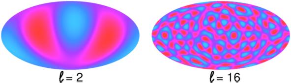
To obtain the CMB power spectrum one roughly speaking decomposes the above shown colorful picture. It contains many structures of various sizes that one takes apart into an overlay of pictures with specific sizes. These are labeled by a parameter l, the multipole moment (see also our earlier post on Anomalous Alignments in the CMB). Below you see as an example l=2 and l=16. Pictorically speaking, l is something like the number of (red) blobs on the equator. Since the equator corresponds to 360°, the size of structures in degrees for a given l is ~ 360°/l.


[Picture from Ned Wright's very recommendable Cosmology Tutorial]


With such a decomposition one gets rid of information like the actual position of blobs, and can analyze the structures of the pattern. In the power spectrum plotted on the x-axis is this multipole moment l, the upper x-axis shows the corresponding scale in degrees. The y-axis (the up-down one) shows the intensity of the temperature fluctuations with the dimension of a squared temperature, micro Kelvin (μK). It is rescaled by a factor l (l+1)/2π (which I think is there to not obscure the intensities with the angular dependent drop in the multipole expansion, please correct me when I am wrong). Note that according to the above the left side of the plot (small l) corresponds to large structures, whereas towards the right, with increasing l, structures become smaller.

If you look at the WMAP picture you would guess that most of the blobs seem to have sizes somewhere around one degree, and indeed you see in the power spectrum the largest peak somewhere around l=200 or so.

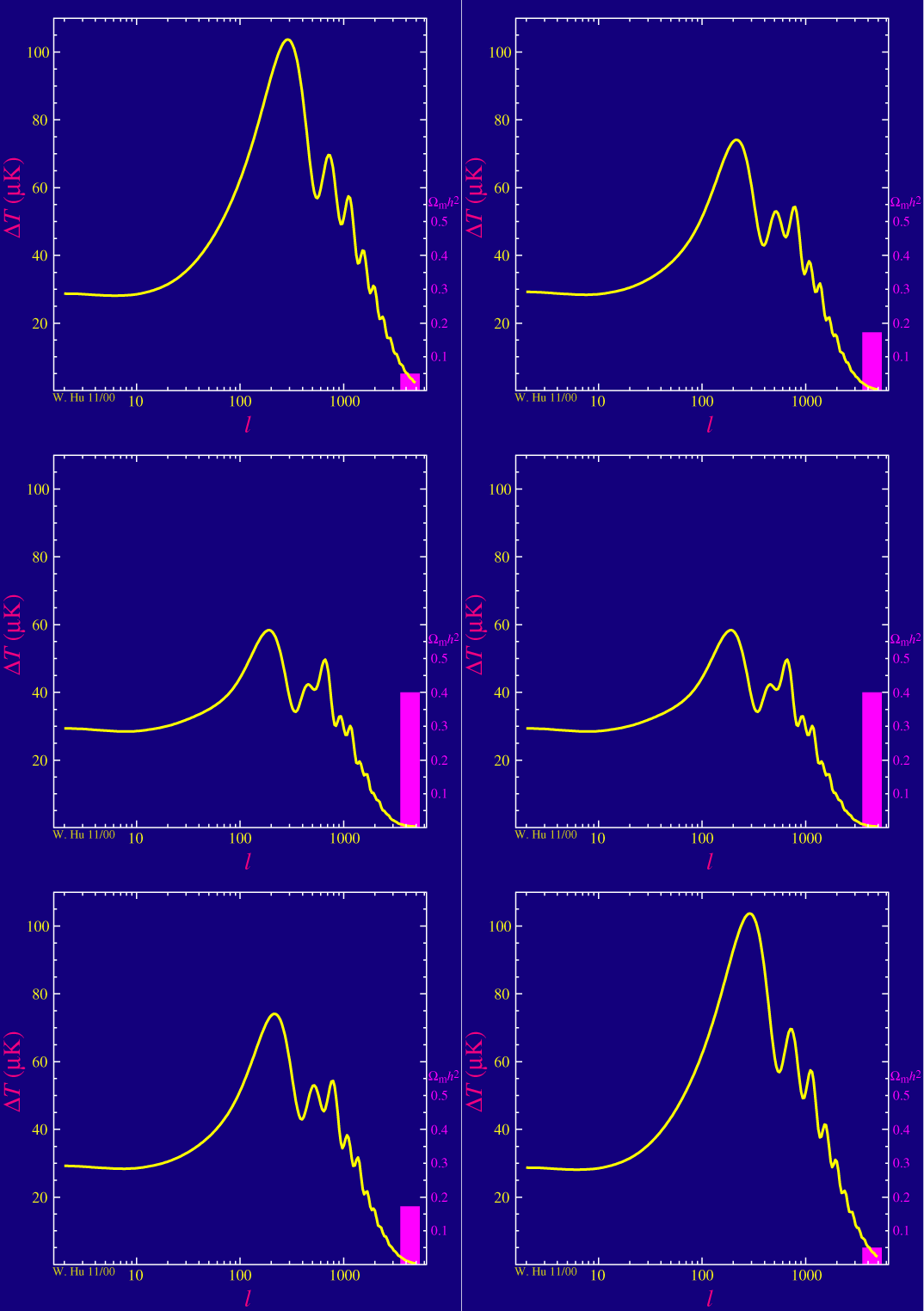
Now what is that important for? The matter content of our universe affects the way it expands. The CMB photons can travel freely from the surface of last scattering on. The power spectrum we observe today carries information about what the universe has done since then. For example consider the fraction of dark matter. If one changes it, one obtains a different curve. The amount of dark matter e.g. affects the power of the even to the odd peaks relative to each other:


[The pink bar shows the fraction of dark matter. Increasing it lowers the power of the even peaks relative to the odd ones. Picture from this website]


Likewise, changing the cosmological constant would shift the first peak around. In such a way, one can find out which parameters fit best the observed spectrum, which then allows us to draw conclusions about the matter content of our universe.

Did you find my initials in the CMB?
See also: The Power Spectrum of audience attention.


This post is part of our 2007 advent calendar A Plottl A Day.

Thursday, December 06, 2007

US $ versus Loonie

The plot below shows the event of the year in Canada, the ratio of the US dollar to the Canadian dollar:


The Canadian dollar reached parity with the US dollar in September 2007 for the first time since 1976 and remained strong. The value of the US $ reached a low of .92 Canadian dollars on November 6th. Luckily, the US dollar rose again (because I still haven't closed my bank account in the US).

PS for the visitors from elsewhere: The Loonie is the Canadian one dollar coin, and yes, they really call it such.


This post is part of our 2007 advent calendar A Plottl A Day.

Wednesday, December 05, 2007

This and That

  • The Journal of High Energy Physics (JHEP) announces that they will pay referees for their reports from 2008 on:

    "Given that peer review is the most valuable asset of journals, we would like to urge again our referees, in an even stronger manner, to be as rigorous as possible when reviewing our submissions. We understand that this task will require an even greater effort by reviewers and we therefore feel that this should be rewarded in some way. Hence, in the spirit that scientific work should be remunerated, we have decided to allocate funds for this purpose and to pay a token fee for every referee report beginning in 2008. We strongly feel that this new practice in the policy of scientific journals is the right step on the way to further improve the quality of our peer review process."

  • The 2007 update of review articles from the Review of Particle Physics is now available online. The Particle Data Group has updated their websites and installed a new search function, but to my annoyance the back button still doesn't work.


  • Garrett Lisi has started a thread at PhysicsForums to discuss technical questions about his paper.

The Phase Diagram of Nuclear Matter

Physical systems consisting of many particles can come about in different phases, depending on conditions such as temperature or pressure: Water can be solid, fluid, or gaseous, and matter made up of atoms with magnetic moments can show spontaneous magnetisation. These different properties are represented in phase diagrams. Now, at the heart of every atom, there is an atomic nucleus built up of protons and neutrons, which again consist of quarks kept together by gluons. Thus, it is natural to ask if there is a phase diagram of nuclear matter, and how it may look like.

And indeed, there is a phase diagram of nuclear matter. Here it is, in a schematic representation, as it shows up in nearly every talk about quark matter and the quark-gluon plasma:


Source: Compressed Baryonic Matter (CBM) Experiment at the Facility for Antiproton and Ion Research (FAIR), GSI, Darmstadt, Germany.

The horizontal axis shows density (that's different from the phase diagram of water we have seen before) - to be precise, net baryon density, i.e., the density of protons and neutrons (which are both baryons) minus the density of antibaryons. Under usual conditions, there is not much antimatter around, and net baryon density is just the density of protons and neutrons. However, in more extreme conditions, for example if the temperature is sufficiently high, thermal energy may materialise in particle-antiparticle pairs, and then, it becomes important to properly distinguish baryon density and net baryon density. The scale for net baryon density is set by the density of nuclear matter in the ground state: atomic nuclei of the different atoms in the periodic system have all the same density of about 1018 kg m-3, or 1015 times the density of water - this value corresponds to a net baryon density of 1 on the horizontal axis.

The vertical axis gives temperature, as in the phase diagram of water. However, as for density, the scale is vastly different. Via Boltzmann's constant, temperature is equivalent to energy - for example, room temperature corresponds to an energy of 1/40 electron volt (eV). In the phase diagram of nuclear matter, temperature is measured in million electron volt, or MeV - that's an enormous temperature scale: 100 MeV correspond to a temperature of about 1.2×10¹² K, or 100 000 times the temperature at the centre of the Sun. On that scale, normal nuclear matter is quite cool - it's represented by the black dot in the lower left corner of the phase diagram at density 1.

Normal nuclear matter consists of neutrons and protons, which are classified as baryons, and more generally as hadrons. In hadrons, the elementary constituents of quarks and gluons are packed together in well-defined bags, made up of three quarks for baryons, and a quark and an antiquark for mesons (the other class of particles among the hadrons). Quarks and gluons are said to be confined in hadrons. The range of density and temperature where this confined phase prevails is shown in the light shade in the lower left part of the phase diagram.

However, if temperature or density, or both, increase, confinement eventually can break down, and quarks and gluons are set free - that's the deconfinement of hadrons to the quark-gluon plasma. At the same time as becoming deconfined, the mass of quarks drops to to a few MeV, which is called the chiral transition. In the phase diagram, the quark-gluon plasma occupies the region shaded in orange.

Deconfinement at high density is believed to happen in the interior of neutron stars, where nuclear matter is compressed under the star's own weight to up to 10 times the normal nuclear density. Deconfinement by heating up nuclear matter is achieved by colliding heavy nuclei at enormous energies, for example at the Relativistic Heavy Ion Collider (RHIC), or at the planned heavy-ion program at the Large Hadron Collider LHC. The red line indicates how nuclear matter is heated up at these collisions and reaches the region of deconfinement.

At this point, it should be clear that it is not possible to explore the phase diagram of nuclear matter in the same way as it can be done with, say, water. We cannot take a chunk of nuclear matter, heat it up or compress it in a controlled way and study its properties. Instead, we have to smash together heavy nuclei, and to rely entirely on the analysis of the fragments that emerge from these collisions to reconstruct the evolution of density and temperature during the event. If deconfinement has occurred in the collision has to be deduced by circumstantial evidence - there are never free, deconfined quarks measured in the detector.

For this reason, the exact details of the phase diagram of nuclear matter are not known yet, and all qualitative features so far are deduced from the fundamental theory of nuclear matter, quantum chromodynamics (QCD). That's why the phase diagram of nuclear matter is usually also called the phase diagram of QCD. Analysing QCD on a space-time lattice using computers, current knowledge suggests that the transition from hadrons to the quark-gluon plasma is of first order at high net baryon density - meaning that there is latent heat, a surface tension, and that the transition occurs via the formation of bubbles - and has a critical point somewhere around a temperature of 150 MeV and a bit above nuclear density. This is completely analogous to the vapour line in the phase diagram of water, which separates fluid from gas and ends in the critical point. The line of the first-order transition is shown in the diagram in yellow.

As a curious consequence of the location of the critical point, when in the very early universe quarks and gluons condensed into hadrons for the first time, this transition was very smooth and gentle - it is what is called technically a cross-over. This is because in the hot early universe, a lot of antimatter was still around, and hence, the net baryon density was very close to zero. For some time it had been thought that the hadronisation transition in the early universe may be responsible for the seeds of structure formation in the universe - with the smooth transition of a cross-over, this cannot be the case.

Of course, it would be very interesting to check the predictions of QCD for the phase diagram in experiment. For example, one could try to identify signals of the first-order transition, or even better, of the critical point. At a critical point, all kinds of fluctuations grow large, and that may yield a good signal. So far, there are very few, and inconclusive data. One problem is, for example, that heavy ion collisions at RHIC are too high in energy and explore high temperatures at low net baryon density, i.e. the cross-over region of the phase diagram. However, starting in 2012, a new experiment at a collider currently under construction at the GSI in Darmstadt, Germany, will hopefully be able to find answers to this issue: The Compressed Baryonic Matter (CBM) experiment at the Facility for Antiproton and Ion Research (FAIR) will achieve higher net baryon densities at moderate temperatures, and hopefully cross the first-order transition and get close to the critical point.

So, in ten years form now, we may know a bit more details about the phase diagram of nuclear matter.


A very general introduction to heavy ion physics and the phase diagram of QCD is given on the pages of CBM and FAIR.

For more on QCD in general, see e.g. QCD Made Simple by Frank Wilczek, Physics Today 53, August 2000, page 22. For heavy ion physics at RHIC, check out What Have We Learned From the Relativistic Heavy Ion Collider? by Thomas Ludlam and Larry McLerran, Physics Today 56, October 2003, page 48, and The First Few Microseconds by Michael Riordan and Bill Zajc, Scientific American, May 2006.

The status of the phase diagram as seen by Lattice QCD is described, e.g., in Exploring the QCD phase diagram by Owe Philipsen, arXiv:0710.1217v1.


This post is part of our 2007 advent calendar A Plottl A Day.

Tuesday, December 04, 2007

Skymap of AGNs with Cosmic Ray Events

Skymap with Cosmic Ray Events and AGNs
[Picture: AUGER Collaboration, click to enlarge]


The above plot by the AUGER collaboration shows the celestial sphere in galactic coordinates. This is essentially a map of the sky much like a map of the earth, where the equator is the Milky Way's galactic plane and the sun is in the center. The black circles with a radius of 3.1° show the arrival directions of the 27 highest energy cosmic rays detected by AUGER with energies greater than 57 x 1018 eV. The red stars show the positions of 472 active galactic nuclei (AGN) within 75 megaparsecs (Mpc) distance to the earth. The blue region defines the field of view of Auger; deeper blue indicates larger exposure, and thus more expected events. The solid curve marks the boundary of AUGER's field of view.

The white * is Centaurus A, the closest AGN. Two of the 27 cosmic rays have arrival directions within 3° of this galaxy.

The data analysis depicted here has been fairly new, and we reported on it in October. The AUGER Collaboration finds correlations between the events of highest energies and AGNs and they are able to reject the hypothesis of an isotropic distribution of these cosmic rays at a confidence level of 99%. This is interesting for two reasons.

First, it is the first time that the sources of these cosmic ray events could be shown to be correlated with the AGN. This reliably rules out speculations about the origin of these UHECRs in local, galactic sources. Though it has been expected, until now there was no experimental confirmation that they originate outside our galaxy. Though one should note that this correlation does not necessarily mean the AGNs themselves are the sources, as the sources could just also be correlated with the AGNs.

Second, this correlation vanishes if one includes AGNs further away than ~90 Mpc, which is what one would expect from the GZK cutoff: at this high energy, a proton's mean free path is below ~ 90 Mpc because the protons will scatter at the CMB background and form pions. The vanishing correlation is thus an independent confirmation for the presence of the cut-off.

For me this is one of the most important experimental results of the year.


This post is part of our 2007 advent calendar A Plottl A Day.

Monday, December 03, 2007

Magnetism and the Ising Model

Some materials have the curious property of being magnetic under normal everyday conditions - for example, they stick to the metallic door of your fridge. Technically speaking, they show a spontaneous magnetisation at room temperature, and are called ferromagnetic, for the Latin name of iron, which is the prototype of a material with these properties. It comes out, the state of being magnetic is a phase, similar to being solid or fluid, and indeed, one can study phase diagrams for magnetic materials. For example, if the temperature of a magnetic chunk of iron is raised above a certain, specific temperature, the magnetisation is lost. This temperature is called the Curie temperature for Marie's husband Pierre, a pioneer of solid-state physics. The Curie temperature of iron is at 1043 K. The appearance (or disappearance) of spontaneous magnetisation at the Curie temperature is not only technologically relevant, it is also very useful for geologists: if ferromagnetic minerals in volcanic lava cool down from red-hot molten rock to below the Curie point, they "freeze in" the orientation of the Earth's magnetic field at that very moment. This allows to reconstruct the orientation and strength of the Earth's magnetic field over history.

One goal of physicists in the early years of the 20th century was to understand how spontaneous magnetisation comes about, and to find a quantitative description of the magnetisation as a function of temperature. To this end, they made simplified assumptions, for example, that atoms behave like miniature compass needles which interact just with their neighbours. One of these models was proposed by the German physicist Wilhelm Lenz in 1920, and then analysed in more detail by his student Ernst Ising - it's the famous Ising model (Ising was born in Cologne, Germany, hence the pronunciation of the name is "eeh-sing", not "eye-sing").

In the Ising model, one assumes that the magnetic moments of atoms can have only two orientations, and that it is energetically favourable if the magnetic moments of neighbouring atoms are oriented in parallel - it costs an energy J to flip one magnetic moment with respect to its neighbour. Then, one applies the rules of statistical mechanics and tries to calculate the magnetisation - the average orientation of the magnetic moments. As it comes out, there is indeed a spontaneous magnetisation below a certain temperature - one of the most elementary examples of spontaneous symmetry breaking. And, even more spectacular from the theorist's point of view, in the special case of a restriction to just two dimensions, Onsager and later Yang (the Yang of parity violation and Yang-Mills theories) could derive an exact formula for the magnetisation M as a function of temperature. It looks pretty complicated,


but the interesting thing is that there is only one free parameter in the formula, the Curie temperature TC, which depends on the energy J necessary to flip a magnetic moment. Essentially, the magnetisation is 1 at zero temperature (meaning that all magnetic moments point in the same direction), and drops to zero as the eighth root when the temperature approaches the Curie point.

As nice as it may be to have such a formula, it would be interesting to check in an experiment if it is correct. However, there is a drawback: It's valid only in two dimensions, i.e. for planar layers just one atom thick, and it works only for magnetic moments which can only be parallel or antiparallel to one fixed direction.

Fortunately, progress in materials science in the 1990s has made it possible to produce thin ferromagnetic films only a few atomic layers thick, with magnetic moments which show indeed the restricted orientation with respect to an axis as described in the Ising model. So, these films should behave like the Ising model, and one can try to measure the magnetisation as a function of temperature. This is what is shown in this plot by C. Rau, P. Mahavadi, and M. Lu:


Figure taken from C. Rau, P. Mahavadi, and M. Lu: Magnetic order and critical behavior at surfaces of ultrathin Fe(100)p(1×1) films on Pd(100) substrates, J. Appl. Phys. 73 No. 10 (1993) 6757-6759 (DOI: 10.1063/1.352476).

It is, unfortunately, not possible to measure magnetisation directly, so one has to rely on other effects which are directly dependent on magnetisation - in this case, one uses a method called Electron capture spectroscopy (ECS): A beam of ions is shot on the film, the ions capture electrons from the surface, and emit light which can be detected. If the surface is magnetised, the light is polarised, and thus, the polarisation of the emitted light is a measure of magnetisation. This is what is plotted on the vertical axis: the polarisation P, normalised to the polarisation P0 at low temperatures. For, as it comes out in the experiment, the polarisation - and hence, the magnetisation of the film - is nearly constant at low temperatures, and drops sharply to zero when approaching a specific temperature, to be identified as the Curie temperature TC. In the figure, normalised polarisation is shown as a function of temperature T, where temperature has been normalised to the Curie temperature. Now, one can compare with the theoretical prediction for the magnetisation of the Ising model as a function of temperature. This is the solid black curve. There are no more free parameters, and, as it comes out, the agreement with experimental data is perfect.

Here is an intriguing circle from experiment to theory back to experiment: Experimental data of ferromagnets measured more than 100 years ago show the appearance of spontaneous magnetisation as temperature drops below the Curie point. Models are constructed to try to understand this, and for a simplified model restricted to two dimensions, an exact formula for the magnetisation can be derived. Finally, real materials show up which correspond to the idealisations and simplifications made in the model, the magnetisation can be measured... and it works!


This post is part of our 2007 advent calendar A Plottl A Day.

Sunday, December 02, 2007

Rotational Curves of Galaxies

Stars and other objects that are bound to spiral galaxies rotate around a common center. The rotation velocity of the stars is such that the orbits are stable. The required velocity for this depends on the attractive force acting on the star, which results from the matter content in the galaxy. The larger the force, the higher the velocity has to be for a stable orbit.

Measuring the velocities of stars as a function of their distance to the galaxy's center therefore allows to draw conclusions about the matter distribution inside the galaxy. The plot below shows an example of the velocity, v in km/s, as a function of the distanceto the center, R in kpc, for the galaxy NGC 3198


[ K.G. Begeman, Astron. Astrophys. 223, 47-60 (1989) ]


Naively one would expect one can estimate the rotation curves as follows. Most of the matter we see is located in the center of a galaxy. The gravitational field is weak enough so one can use the Newtonian limit. A star in the outer arms should thus roughly follow an orbit on which the attractive gravitational force balances the centripetal force. Requiring both to be equal one finds that the square of the stars velocities should drop with the inverse of the distance to the center:


If you look at the plot above however, you see that this is not what we observe. Instead, the velocity seems to become constant towards the outer regions. And the above example is not a single case. If you look at Begeman's paper, you will find many similar looking curves for spiral galaxies (for more recent measurements, see e.g. astro-ph/0107326).

The observations can be explained by assuming a significant amount of non-visible (dark) matter which is distributed through the galaxy. This dark matter is today the most widely accepted - though not the only - explanation for the rotational curves. The challenge here is that the ratio of dark matter to visible matter (the mass-to-light ratio, commonly denoted M/L) depends on the type of galaxy. E.g. globular clusters show little or no evidence for dark matter.

For other experimental evidence, see also our previous post on Dark Matter.


This post is part of our 2007 advent calendar A Plottl A Day.

Saturday, December 01, 2007

Phase Diagram of Water

Matter comes in different forms, we learn at school: solid, liquid, and as gas. December days in Canada give us plenty of occasions to experience these different forms of matter - phases, as they are called in physics and chemistry - in the case of water: ice and snow, the both annoying and beautiful appearances of solid water, the liquid form in rain and fog, and if the Sun succeeds to disperse the fog, tiny water droplets have evaporated, and the water has been transformed into invisible gas.

Ice melts at a temperature of 0°C (or 273.15 Kelvin), and water boils at 100°C (or 373.15 Kelvin). However, to be precise, these melting and boiling temperatures are not fixed - they depend on the ambient pressure. On top of a mountain, say the Puy de Dôme, air pressure is lower than in the lowlands, and as consequence, water boils at temperatures below 100°C.

To get a better overview how the occurrence of the different phases of water - solid ice, liquid water, gaseous vapour - depends on temperature and pressure, it's a good idea to plot in a diagram the transition lines between the different phases as a function of these two parameters. Such a diagram is called a phase diagram. And a simplified version of the phase diagram of water looks like this:


The x-axis of the diagram shows the temperature T in units of Kelvin (K). Keep in mind that 0°C = 273.15 K and 100°C = 373.15 K - both temperatures are marked by the grey vertical lines. The y-axis shows the pressure p in units of Megapascal (MPa), where 0.1 MPa = 1000 hPa = 1000 mbar and the standard atmospheric pressure is 1013 mbar. Since pressure covers a huge range of values from the very small to the very large, a convenient way to represent this is the usage of a logarithmic scale. Thus, the phase diagram manages to represent pressure from 1/100.000 of ambient pressure to 1 million times ambient pressure. Ambient pressure is marked by the horizontal grey line.

The blue line in the diagram is the melting line - it separates ice from liquid water - and the light-blue line the boiling line, which divides liquid and gaseous water. The green line is the so-called sublimation line, across which ice transforms directly to the gaseous states, without the intermediate step of liquid water. All three lines meet at one point (marked by the black dot) which is called the triple point - at this value of temperature and pressure, all three forms of water can coexist. At sufficiently high pressure, water solidifies even at temperatures well above room temperature: these transitions to different sorts of ice (distinct by the respective crystal structures) are shown as the red and orange line. Trying to understand these different phases of ice is a topic still under investigation, both by experiment and by theory.

One feature of the diagram might seem strange at first sight: The boiling line separating liquid and gaseous water ends at one point. This is a very generic feature of all liquid matter: At high enough pressure, the distinction between liquid and gas gets lost - essentially, the difference in density between gas and liquid becomes zero, and the latent heat of condensation/evaporation vanishes. The end point of the boiling line, marked by the grey dot, is called the critical point. If temperature and pressure can be chosen such that the fluid is very close to the critical point, it will develop bubbles of gas containing small droplets of liquid containing small bubbles of gas... and as a result of bubbles and droplets of many different sizes, covering the range of wavelengths of visible light, the system becomes opaque. This quite spectacular effect is called critical opalescence.

But of course, we can also recover our mundane everyday experience with water in the diagram: If we increase temperature at constant ambient pressure, following the horizontal grey line, we cross the blue melting line at 0°C, and the light-blue boiling line at 100°C - that's the melting of ice and the boiling of water as we know it. And we see that if ambient pressure is reduced, for example during stormy weather or on top of a mountain, the crossing of the horizontal line and the boiling line shifts to lower temperature: Water will boil at temperatures below 100°C. At a height of 2000 m above sea level, for example, water boils at about 94°C - things to keep in mind if boiling an egg on a mountain.

If you look closely, you can note that the blue melting line is slightly inclined, meaning that with increasing pressure, the melting temperature drops slightly. This effect is often invoked as an explanation for the low friction of skates on ice: The pressure applied by the weight of the skater reduces the melting temperature of ice, causing a thin film of liquid water, on which the blade of the skate glides nearly without friction, or so goes the story. This, however, is not the whole truth: the small, pressure-induced reduction of the melting temperature is not sufficient to produce this effect. While it's correct that the reduction of friction is caused by a slippery film of water on the surface of the ice, this film is created by complicated mechanisms whose details are still under debate.

So, an elementary plot such as the phase diagram of water can still hide some surprises and riddles for us.


Phase diagram data via www.chemicalogic.com. Source for the sublimation and melting lines: W. Wagner, A. Saul, A. Pruß: International Equations for the Pressure along the Melting and along the Sublimation Curve for Ordinary Water Substance, J. Phys. Chem. Ref. Data 23, No 3 (1994) 515 (PDF file from NIST). Source for the saturation line: IAPWS Industrial Formulation 1997 for the Thermodynamic Properties of Water and Steam (IAPWS-IF97).

You can find much more about the phase diagram of water - and about the properties of water in general - at Water Structure and Science by Martin Chaplin.

The physics behind the slickness of ice has been discussed by Robert Rosenberg in Why Is Ice Slippery?, Physics Today, December 2005, pages 50-55 (doi 10.1063/1.2169444, subscription required).


This post is part of our 2007 advent calendar A Plottl A Day.

A Plottl a Day

candleMy beloved husband and I, we've been thinking really hard what we would blog through the advent season. Since I always loved advent calendars, we finally decided to take a plot each day, and briefly explain why we have seen it so many times already that people no longer bother to say what's actually plotted on it. I hope you'll have as much fun with it as we had :-)


In this context, a quotation from a seminar I attended last month, believe it or not:

Question: "What is plotted on the y-axis?"
Silence.
Speaker looks confused: "You mean the up-down one?